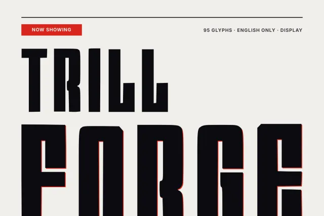
A tall, narrow display face with flared stems, built for headlines, labels and money-themed layouts.
Empire Ledger is a tall, narrow display face with the mood of an old bank hall. Stems swell a little toward their ends and finish in small wedge feet, so each letter looks cut from a plate rather than drawn with a pen. Contrast stays low.
Look at the lowercase l. It carries a foot and reads almost like a small capital L, which gives words such as black and Balance an odd, stiff rhythm. Descenders on g, p and q drop long, and the capitals keep a strict vertical posture. Set it big. At 200 px the flared strokes carry the whole look, and at 30 px it still works for a short caption, though the wedges fade into plain stems at that size. Use it for banknote and certificate mockups, ledger-style menus, bank or spirits labels, book covers and narrow headline columns.
The font holds 94 glyphs: A to Z, a to z, figures 0 to 9 and basic punctuation with quotes, guillemets, parentheses and dashes. It covers English. There is one weight, Regular, delivered as OTF, TTF, WOFF and WOFF2.
Desktop, Web, ePub and App licences are sold separately on this page, each as a one-time purchase.