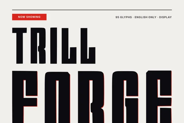
A heavy, wide display face with flared strokes and inked edges, for gig posters, flyers and loud print
Lead Press sets heavy, wide letters that look printed hard. Strokes flare toward their ends. The edges are slightly uneven, as if ink spread under pressure, and small notches pinch the joints, so the result sits somewhere between an old press proof and a late night show flyer.
Look at the big Gg on the glyph study card. The capital is round and open, the lowercase g drops into a blunt hooked tail, and neither has a clean geometric curve anywhere. The lowercase uses forms close to small capitals, which gives lines of text a flat, blocky top edge. Use it for one or two words at a time. Posters, record sleeves, beer labels and neon style signs suit it, and the pangram card shows it still reads as a full lowercase sentence on black strips.
There are 93 glyphs for English: A to Z, a to z, heavy figures 0 to 9 and marks such as guillemets, brackets, the apostrophe and the question mark. One Regular weight. Files come as OTF, TTF, WOFF and WOFF2.
Desktop, Web, ePub and App licences are bought separately on this page, with one payment each and no expiry.