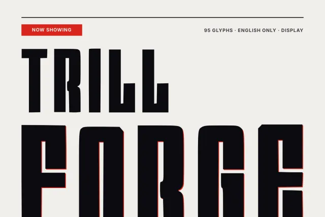
An ultra condensed oblique display face with heavy stems and hairline joins, for fashion, noir and jazz posters.
Velvet Paradox pairs two opposite strokes in every letter. Main stems are heavy and dark, the connecting strokes thin out to hairlines, and the whole alphabet leans hard forward at a steep, even angle. That tension gives it a noir, after-hours mood.
The letters are extremely tall and narrow. Terminals are cut flat and sheared along the slant, joins meet at sharp angles, and the bowls of P and a stay narrow and pinched. It wants wide letter spacing, the way the Late Set poster card sets it. Keep it large. At 280 px the hairlines look crisp and deliberate, while at 40 px they turn into thread and a long sentence gets hard to read. It belongs on fashion magazine covers, perfume and cosmetics packaging, jazz and club posters, film titles and narrow column headlines.
The font has 94 glyphs: 26 capitals, 26 lowercase letters, 10 figures and basic punctuation. It covers English. One weight, Regular, is delivered as OTF, TTF, WOFF and WOFF2.
Desktop, Web, ePub and App licences are sold separately on this page, each as a one-time purchase.