A wide, heavy geometric sans for race numbers, motorsport graphics, team kits and loud sports branding
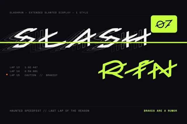
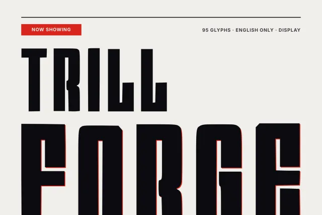
FORMULA ONE TORQUE is an extended sans with heavy, even strokes and curves pressed into rounded squares. It looks like the lettering painted on a car door or a pit wall board, wide enough to read at speed. Nothing thin here.
Letters run broad and low. O and Q turn into squarish ovals, C and G open wide, and the lowercase a is a single round bowl with a straight stem, so words stay compact in height while they stretch across the line. It belongs at large sizes: race numbers, lap timers, team kits, event posters, esports overlays, garage and car club logos. On dark backgrounds the heavy strokes hold up even with a hard offset shadow behind them.
The font has 93 glyphs in one Regular weight, covering capitals, lowercase, the digits 0 to 9 and basic punctuation such as the colon, full stop, hyphen and exclamation mark you see in LAP 1:21.034. It supports English. Formats are OTF and TTF for desktop work and WOFF and WOFF2 for the web.
Desktop, Web, ePub and App licences are sold separately on this page.