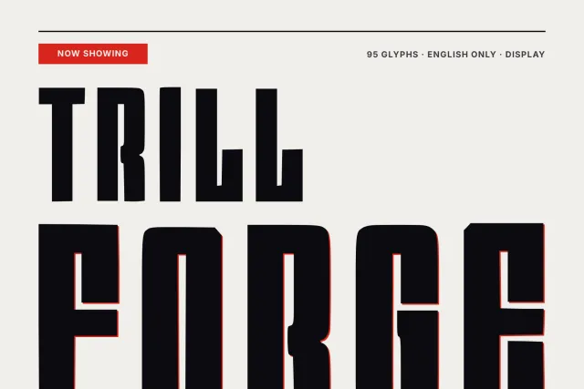
A heavy, narrow serif with flared wedge serifs and a slightly uneven hand, for headlines, labels and menus.
Quirk Ledger is a heavy, condensed serif that looks a little hand-cut. Strokes widen into flared wedge serifs, and the curves lean a little off true, so the bowls never look machine-made and every word keeps a slight wobble. Think Victorian wood type. It recalls old shop signage without copying it.
Capitals are tall and tightly spaced, and the A drops its crossbar in favour of a sharp, narrow peak. The lowercase g has a double storey. Big sizes show the wedges best. The size ladder runs from 220 px to 32 px, and a full sentence still reads at the bottom of it, so you can set a headline and a short deck line in the same face. Try it on invoices and price lists, café menus, jar and bottle labels, book covers and editorial headlines.
There are 94 glyphs: A to Z, a to z, figures 0 to 9, punctuation, quotes and dashes. Language coverage is English. One weight, Regular, ships as OTF, TTF, WOFF and WOFF2.
Desktop, Web, ePub and App licences are sold separately on this page, each as a one-time purchase.