A blocky, wide sans with squared bowls for logos, headlines and brand marks that need to look solid.
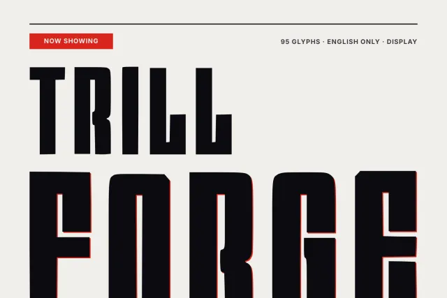
Slate Prestige is a heavy sans built from rectangles with softened corners. Bowls in a, b, d, o and p are squared off, the sides of the letters run straight, and the counters stay small, so a word reads as one dense block. The author asked for type that can sit next to a car logo, and you can feel that brief in the wide stance and the flat, engineered curves.
Look at the G and the R. Their joins are cut at a slant instead of rounded, which gives the face a machined edge. Set big. At poster and hero sizes the heavy strokes hold together, and on the specimen cards it carries a certificate headline, a website hero line and a bold numeral block without losing weight. Use it for logos, sports and auto graphics, merch, packaging fronts and short headlines. Long paragraphs are not its job.
The set has 94 glyphs: A to Z, a to z, figures 0 to 9 and basic punctuation for English. There is one Regular weight, delivered as OTF, TTF, WOFF and WOFF2.
Desktop, Web, ePub and App licences are bought separately on this page, each with a single payment and no expiry date.