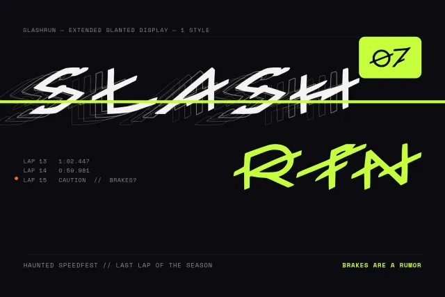
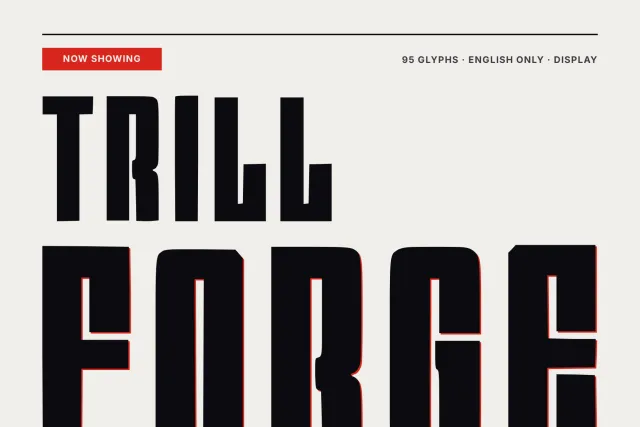
Четири начини да направите фонт
Опишете го расположението, ерата, намената. Добијте цел фонт за неколку минути.
Започни → Од сликаПрикачете лого, постер или натпис. Ги реконструираме буквите што ги гледате.
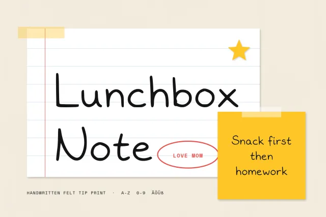
Прикачи → Од ракописОд фотографија на пополнет лист добивате фонт од вашиот ракопис.
Преземи го листот → Увези фонтПрикачете TTF или OTF, додајте јазици, уредете глифови и повторно извезете.
Увези →Категории
Во тренд оваа недела
Прегледај ги сите →
A heavy serif with ball terminals and soft bracketed feet, for posters, headlines and vintage style packaging.
KATSEYE is a heavy, friendly serif. Strokes are thick and contrast stays low, while the serifs blend into the stems through soft curved brackets that take the edge off every corner. It sits close to the bold headline faces of Victorian posters and old newspapers.
The ball terminals are what you notice first. They round off a, c, f, j, r and y, and capital J ends in a ball hook too. Q drops a curled tail, and the leg of R kicks out in a small curve. At large sizes these rounded endings keep the weight from feeling harsh, so the font works for pop posters, editorial headlines, book covers, labels, signage and loud social graphics. Long text gets dense.
There are 94 glyphs for Latin: capitals, lowercase, numerals 0 to 9 and punctuation including guillemets and inverted marks. One Regular weight. Files in OTF, TTF, WOFF and WOFF2.
Desktop, Web, ePub and App licences are sold separately on this page.
Најавете се преку Google — добивате 100 глифови за генерирање фонт на кој било јазик.
или најавете се со е-пошта