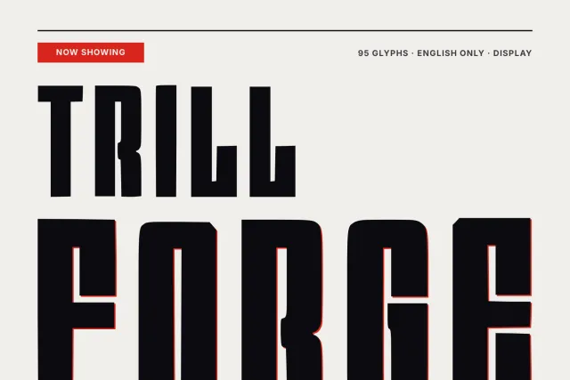
A thin, straight-cut sans with diamond figures, drawn for craft brands, workshop labels and festival posters.
Anvil Forge is built from straight lines and hard corners. Every letter uses one thin, even stroke, and curves give way to short angled segments, so the S folds into a zigzag and the O becomes a squared ring. It feels rune-cut, like marks scratched into metal with a point. Cold and exact.
The figures give it its own face. The 0 is a single diamond, the 8 is two stacked and the 9 hangs a straight tail off one, and they keep that shape inside prices, dates and page numbers, as the numeral card shows. On the cards it fronts a blacksmith festival poster called Iron Night, a tote and a mug for a forge shop, and a pairing with a calm text serif for paragraphs. Use it from about 48 px up.
Capitals and lowercase are separate drawings, 52 letters in all, and with figures and punctuation such as brackets, guillemets, hyphen and dash the set comes to 94 glyphs. Latin for English, one Regular weight, OTF, TTF, WOFF and WOFF2 files.
Desktop, Web, ePub and App licences are bought separately on this page, each with one payment and no expiry date.