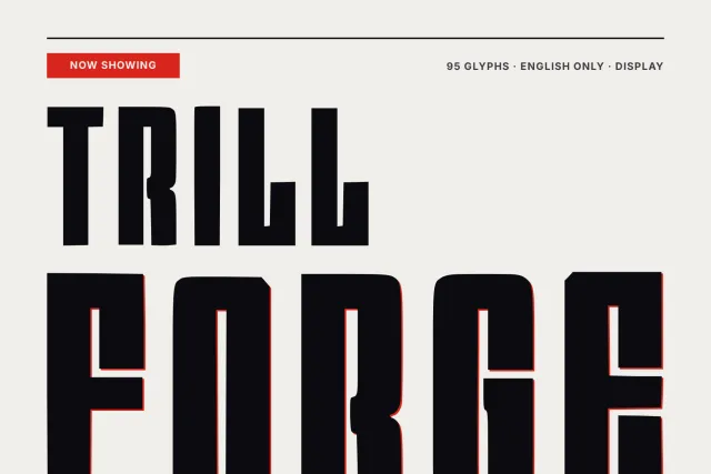
A geometric display sans with slanted cut terminals and diamond dots, made for winter magazines, posters and route signs
Icebound Sledge reads like a geometric sans copied out of an expedition log. Round bowls, wide and calm. The stroke ends break that calm, because the ascenders of b, d, h, k and l stop in a slanted cut and the dots on i and j are small diamonds instead of circles.
Set it big. On a magazine cover, a north pole poster in orange and navy or a route board listing camp numbers and kilometres, the cut ends give each word an edge while the even stroke keeps it solid against dark and bright grounds. It works lower down too. The size ladder on this page runs from a 200 px headline to 30 px folios and footnotes, and the letters stay open at the small end.
Inside are 94 glyphs for English: A to Z in both cases, figures 0 to 9 and the basic marks, including brackets, colon, question and exclamation marks. There is one Regular style. You get OTF and TTF for print and desktop layouts, plus WOFF and WOFF2 for a website.
Desktop, Web, ePub and App licences are bought separately on this page, each with one payment and no expiry date.