Чотири способи створити шрифт
Опишіть настрій, епоху, призначення. Отримайте повний шрифт за кілька хвилин.
Почати → Із зображенняЗавантажте логотип, постер чи вивіску. Ми відтворимо літери, які ви бачите.
Завантажити → З рукописуФото заповненого бланка перетворюється на шрифт із вашим почерком.
Отримати бланк → Імпорт шрифтуЗавантажте TTF або OTF, додайте мови, відредагуйте гліфи й експортуйте знову.
Імпортувати →Категорії
У тренді цього тижня
Дивитися всі →
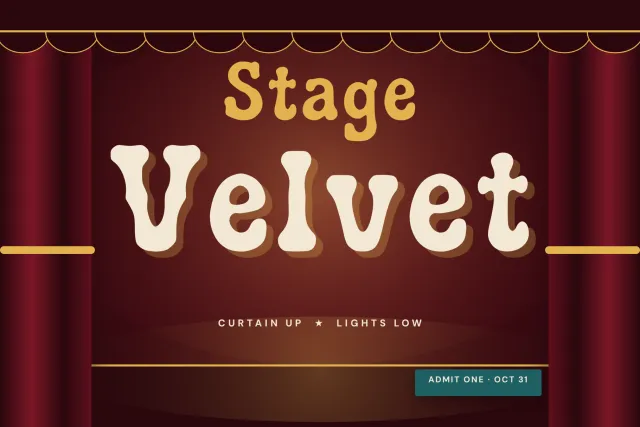
A heavy serif with ball terminals and soft bracketed feet, for posters, headlines and vintage style packaging.
KATSEYE is a heavy, friendly serif. Strokes are thick and contrast stays low, while the serifs blend into the stems through soft curved brackets that take the edge off every corner. It sits close to the bold headline faces of Victorian posters and old newspapers.
The ball terminals are what you notice first. They round off a, c, f, j, r and y, and capital J ends in a ball hook too. Q drops a curled tail, and the leg of R kicks out in a small curve. At large sizes these rounded endings keep the weight from feeling harsh, so the font works for pop posters, editorial headlines, book covers, labels, signage and loud social graphics. Long text gets dense.
There are 94 glyphs for Latin: capitals, lowercase, numerals 0 to 9 and punctuation including guillemets and inverted marks. One Regular weight. Files in OTF, TTF, WOFF and WOFF2.
Desktop, Web, ePub and App licences are sold separately on this page.
Увійдіть через Google — отримайте 100 гліфів для генерації шрифту будь-якою мовою.
або увійти через ел. пошту