// About this font

A heavy unicase display face with swelling strokes and blade-sharp ends, made for posters, record covers and logos

Rapier Mark is a heavy display face whose strokes swell, pinch and end in sharp, blade-like points. The mood comes from seventies record sleeves and gig posters. Loud, and meant to be.

The alphabet is unicase. Capitals and lowercase are drawn on one height with almost the same shapes, only R and S change between the two slots, and the counters of R, P, O and Q are cut as narrow teardrops that lean like poured liquid. Strokes are dark and the gaps between them tight, which puts it in headlines and keeps it out of body copy. Put it on album covers, festival posters, logos and menu headers.

The file holds 62 glyphs: 26 letters in both case slots and the digits 0 to 9, with no punctuation marks, so plan headlines without commas or full stops. One Regular weight, English only. OTF and TTF cover desktop apps, WOFF and WOFF2 the web, and the numerals keep the same flared shapes, so a date on a poster reads as part of the lettering.

Desktop, Web, ePub and App licences are sold separately on this page.

Languages 1
Anglais
Weights 1
Regular
Glyphs
62
Formats
OTFTTFWOFFWOFF2
Style
Display
// Testeur de police
Taillepx
Espacement des lettrespx
Espacement des lignesem
Texte Fond
// Jeu de glyphes · 62
English · 52
ABCDEFGHIJKLMNOPQRSTUVWXYZ
abcdefghijklmnopqrstuvwxyz
0-9 Chiffres · 10
0123456789
// Styles de cette famille
Regular 450 Sphinx of black quartz, judge my vow.
// More from the marketplace
All fonts
par YoFont1 langueSans serif

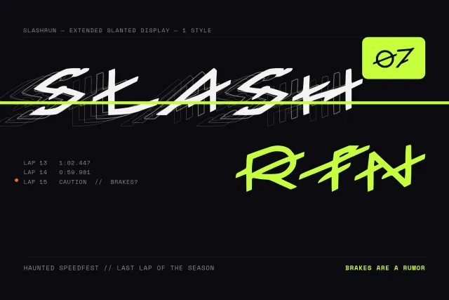
Slashrun

dès $9
par YoFont1 langueDisplay
par YoFont1 langueManuscrite
par YoFont2 languesDisplay

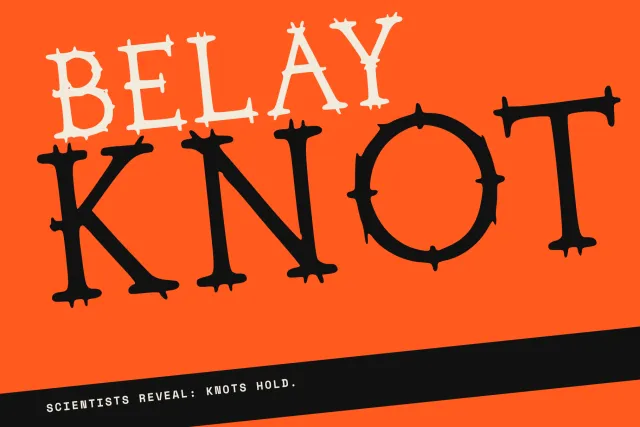
Belay Knot

dès $9
par YoFont1 langueDisplay

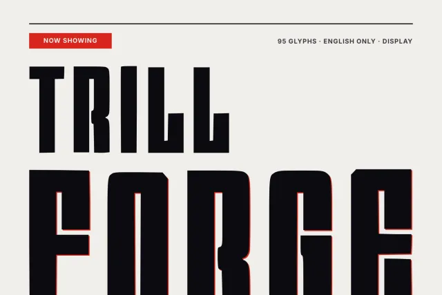
Trillforge

dès $9
par YoFont1 langueSans serif